Introduction
My two favorite things are marketing and sports. I was curious about which professional sports team has the most generic brand.
It is important to note a brand is technically a set of promises made by the company of the brand that are then associated with the company’s brand identity (name, logo, color scheme, etc). I aim to focus on a team’s brand identity. By using key parts of a team’s brand identity and no other prior knowledge, could I identify the sport, the city/location, or the character/mascot of the team?
In this blog, I hope to give a constructive take on the rebranding of a professional sports team. On top of that, I hope readers can learn a few things about branding and marketing.
Who are the Columbus Blue Jackets?

The Columbus Blue Jackets are a professional hockey team in the National Hockey League (NHL), from Columbus Ohio. The team was founded in 2000 as an NHL expansion team. The team’s brand is inspired by the state of Ohio and Columbus’ historic significance in the American Civil War. Let's break down the team's brand!
Brand Break Down:
Brand Name: Columbus Blue Jackets
Location: Columbus, Ohio
Arena/Home Ice Rink: Nationwide Arena
Primary logo:
The teams logo is a silver star with the Ohio state flag flying past. The shape the flag makes around the star is supposed to be in the shape of a "C" for Columbus. This team has used this logo since 2007. A log of the team's past logos can be seen here.
Team Uniforms:

The team has 3 sets of jerseys: top for home games, bottom for away games, and the third, the throw back jersey, for special occasions. The home and away jerseys are inspired by their logo. The throw back jersey is inspired by the historic significance of the team's city and state to the American Civil War.
Mascots: Stinger & Boomer


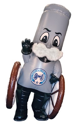
The team's primary mascot is Stinger, seen on the left. Stinger is important to team events, promotions, and advertisements. Boomer is the team's union civil war canon who plays a critical role in the team's game day experience.
Why is a teams brand important?
Brand Awareness
The purpose of a brand is to build brand awareness and to be distinguished from competitors. Brand awareness, according to HubSpot a leader in Marketing Services, is "how familiar your target audience is with your brand and how well they recognize it." In HubSpot's Ultimate Guide to Brand Awareness, they give the ultimate reasons why the Blue Jackets, and others with a brand, should want to build brand awareness, which includes the following:
Fostering Trust Fostering trust means gaining the trust of customers through the reliability of a product or service. For the Blue Jackets, trust is in the reliability of winning games. The benefit of fostering trust is loyalty among customers.
Creating Association Association for a brand means the consumer associates certain things including actions, emotions, or certain activities with a brand. When the Blue Jackets’ brand is seen, people should associate their brand with hockey, Ohio, or winning/ success. Creating association impacts how quick a brand rises to the top of consumers’ minds when deciding among many brands. Therefore, it is important that a brand effectively communicates their identity to the customer.
Building Brand Equity To build brand equity means growing your brand's overall value. This is determined by consumers' experiences with and overall perceptions of the brand. Brand awareness is not the only thing that contributes to brand equity. Though it is the first steppingstone to establishing it. For example, the demand for Nike can be attributed to the consumers awareness for Nike’s logo. Without brand awareness, consumers will find it hard to associate their positive experiences or the generosity of a company to its brand.
After the team's brand break down, could you check-off all the boxes:
Where is the team located?
What is the team's mascot?
What sport does the team play?
What is the inspiration for the theming of the team's brand?
If you hesitated answering these questions, then the team's brand identity is likely not strong at capturing brand awareness.
Where does the Blue Jackets Brand Fall Short?
Team's logo does not communicate the sport or the character of the team.
Color scheme of the team's jerseys (Red, White, & Blue) is too common for a team from the United States, whose national colors are the same.
Team's primary mascot does not align with the team's colors and needs to be included in their logo.
How can the Columbus Blue Jackets improve their brand?
Team Performance
The Blue Jackets can start improving their brand by winning some more games, playoff games more importantly. Since 2000, the Blue Jackets have only made the playoffs 6 times (31st in the NHL). Making the playoffs or even better, winning the Stanley Cup, is the ultimate way for any hockey team to boost their brand. For now, the easiest things the Blue Jackets can do for their brand are to adjust the the components of their brand identity.
Logo Design
Beginning with the Blue Jackets logo, this is the most important brand component the Blue Jackets should consider changing. Since their logo is seen on everything associated with the team: uniforms, their home ice rink, fan apparel, and all promotions and marketing, changing the logo will have the most immediate impact on the brand's recognition.
How the Blue Jackets can fix their logo is not up to me. But if I were the marketing director, I make the following changes:
Remove the star from the logo, replace it with a version of the team's mascot.
Add a symbol for hockey - hockey stick or ice skates on the mascot
Change the colors - remove red, replace it with gold.
Team Uniforms
Next, the team uniforms can be improved to enhance fans' ability to recognize the team during games, especially on TV. The key details of a uniform’s design include its colors, logos, and patterns. Redesigning the uniforms is a balancing act between aligning with the team’s brand and standing-out amongst the jerseys of other NHL teams.

The jersey redesign for the Columbus Blue Jackets by Zeno Minotti is a great example of how the Blue Jackets jerseys could stand out amongst other NHL teams and have a unique identify for themselves. The throwback jersey is an exceptional model for improving the current home jersey. These jerseys are more aligned with the team’s identity because they have more references to the Ohio state flag, like the patterns on the jerseys' sleeves and the blue and gold is more unique.
Team Mascot
Lastly, a new image for the mascot would be important because it is a focal point for the team’s brand in many things including events, advertisements, and promotions. The reason the Blue Jackets changed their logo in 2007 was to have a sleeker, more serious image. Why not the mascot too? It looks like a cereal box cartoon. The mascots color and animation should be changed so that it looks more appealing. For example, its current green color can be swapped for gold since that is a popular alternative color with navy blue and it expresses a more serious appearance. In addition, a mascot redesign can go along with a logo redesign.

[Please excuse my poor graphic design skills. You get the idea.]
Conclusion
The Blue Jackets’ brand falls short in its ability to communicate the team’s identity including their location, sport, character/mascot, and history. If I am a a Columbus Blue Jackets fan, I make the mentioned changes so that my team's brand is recognized and remembered by anyone who sees it. Until then, I am stuck with opposing fans confusing my team with another hockey team or worse a team of an entirely different sport.
Leave a like if you agree the Blue Jackets are the most generic professional sports brand. Let me hear your thoughts and feedback with a comment below!
Much appreciated,
Matt McCurry
Aspiring Digital Marketer
Comentários